1. Reebok: A well-known brand that sells athletic apparel.
Reebok has a website that is exploding will different colors and innovative design techniques. The dark background brings out the pastel colors of the shoes on this particular page which draws in the customer looking at the site. I was drawn into this page by the colors and circular shape of the arranged shoes. I was interested and kept reading more information on the "design your own" page. The website is easy to navigate, the layout is simple, and the elements flow well through out the whole website.

2. Rupert Wines: High-quality wines produced in South Africa.
Rupert Wines has a simple, but powerful approach. The site's graphics consist of detailed and high quality photographs of wine bottles and landscapes, which represent the product and and location well. The wine bottles on the landing page caught my attention and interest. They look so simple, yet elegant, with a plain background and symmetrical look. This site also has recipes and news, which help with site stickiness.

3. Jenier World of Teas: High-quality teas and teaware.
The Jenier landing page has a very warm and welcoming feeling, which corresponds to the autumn season. The warm cup of tea surrounded by the fall leaves intrigues me and makes me want to have that kind of experience this fall season. These warm images are followed by copy that says "Enjoy warmer Autumn moments with our luxury teas." I enjoy the way the products are listed on the products pages. The tea is not found in packages, but the actual ingredient is poured out filling one corner of the image. The site also integrates social components, testimonials, and blogs into the design which are important in giving customers social proof.

This is the the largest and most successful e-commerce website on the Internet. Although it is more cluttered than the other sites listed on my blog, I think it is important to mention Amazon. There are so many different products on Amazon, and they do a great job at organizing the products and making them easy for the visitor to find. The landing page advertises the new kindle, which is a product of theirs, in a unique fashion my putting it at an odd angle to show the sleekness of the product.

5. Optimo Hats: Custom hates in Chicago Area.
Although the "store" part of the website is "coming soon" Optimo Hats has a truly modern and innovative look. The images of the hats are high quality and have a lot of detail. You can also see the hat from different angles once you click on the hat. I find the shadow below the hat a detail that is necessary to give the page depth.

6. Budnitz Bicycles: Budnitz light weight, city bicycles.This website is visually appealing, and simple. The images draw you in and give you feelings of inspiration and motivation. The images in the product pages of the site are also very simple, just a bike on a white background. I like this set up because there are no distractions from the main object. There is no clutter, which makes it modern and simplistic.

7. Beoplay: A website that sells headphones and speakers.
This interactive website is different than most. Its navigation is non-traditional and innovative. Instead of clicking on a navigation bar, you simply push the down button and it takes you on a tour of the product. When you click on the product, instead of you reading about what the product does, you watch what the product does.
8. Poketo: A Brick-and-Mortor Shop/Gallery in LA
This site is very similar to number 10, Saturdays NYC's website, which have photographs with gray backgrounds. The artistic website is very beautifully designed. The site is easy to navigate and the shopping cart is easy to use.

9. Staples: Well-known Office Supplies Store
Although this example is more "cluttered" than other sites I have chosen, Staples is a successful E-commerce website that we all can learn from. Due to the vast amount of supplies that are sold through Staples, it is not surprising that it is cluttered. This site is simple to navigate and the shopping cart is easy to use. There is a very modern approach to selecting supplies for the shopping cart for items such as ink cartridges. I also like how all the merchandise has nice and clear photographs.

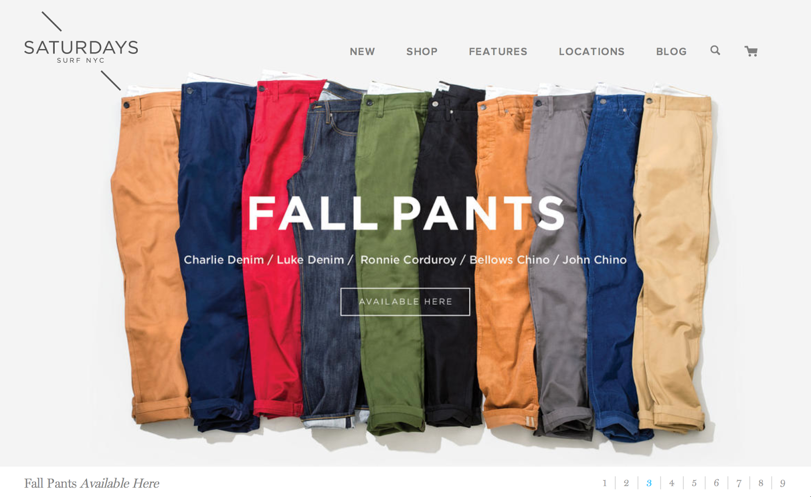
10. Saturdays NYC: New York's premier downtown surf shop
The best part of this site is the way the products are set up in the product pages of the website. Everything is set on a square gray background. The landing page as a nine-ad slideshow advertising different products. The site is easy to navigate, shopping cart is easy to use, and there is no clutter that is "in the way."
No comments:
Post a Comment